MUST SEE CHART: Something Quite Interesting Happened In The Silver Market
Posted by SRSrocco on August 27, 2015
Something quite interesting took place in the silver market and I believe few investors realize the significance. After looking over the data, I came across some fascinating evidence that shows just how fearful individuals are about investing in the paper precious metal markets.
While analysts and investors are familiar with the data put out by the Silver Institute and World Silver Surveys, we can see an entirely different picture when we combine the figures in a certain way. What I am trying to say here is this… by crunching the official data (even though it might be understated or manipulated) we can see very interesting trends that aren’t noticeable when looking at the individual figures.
This is one of the more important analytic tools I like to use at the SRSrocco Report. By crunching the numbers and looking at figures in a certain way, I can see certain trends that may not be apparent to most investors.
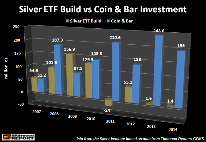
Before we look at the chart that (I believe) proves investors have become increasingly fearful of the paper markets, let’s look at the chart below. This chart shows the difference between the build of Silver ETF inventories versus Silver Coin and Bar investment demand.
As we can see, Silver ETF inventories and Silver Coin & Bar demand both increased after the collapse of the U.S. Investment Banking System and Housing Market in 2007. Global Silver ETF’s saw their inventories increase from a build of 54.6 million oz (Moz) in 2007 to 156.9 Moz in 2009. While physical Silver Bar & Coin demand increased from 51.2 Moz in 2007 to 187.3 Moz in 2008, it fell nearly 100 Moz in 2009 to 87.5 Moz.
For whatever reason, Global Silver ETF inventories increased in 2009, even though the average annual price of silver fell to $14.67 compared to $14.99 in 2008. When the price of silver jumped to an average of $20.19 in 2010, the build of Global Silver ETF inventories fell to 129.5 Moz (compared to 156.9 Moz in 2009), while demand for Silver Bar & Coin increased to 143.3 Moz.
However, something interesting took place in 2011. This was the year the price of silver nearly touched $50. As you can see from the chart, Global Silver ETF inventories actually suffered a net 24 Moz decline in 2011, while Silver Coin & Bar demand skyrocketed to 210.6 Moz. A significant portion of this physical silver investment was due to a large increase of Indian silver bar demand in 2011.
If we look at the next several bars in the chart (2012-2014) we can see a serious change in the silver market. Even though there was a 55.1 Moz build in Global Silver ETF inventories in 2012, the next two years saw very little silver enter into this investment market. There was a paltry increase of Global Silver ETF inventories of 1.6 Moz in 2013 and 1.4 Moz in 2014.
Now, on the other hand, Silver Bar & Coin demand shot up to a record 243.6 Moz in 2013 and 196 Moz in 2014. Basically, savvy precious metal investors decided to take advantage of the lower silver price in 2013 and 2014 by stocking up on a great deal of physical silver while Main Stream investors brainwashed by Wall Street, had no motivation to park their money into Silver ETFs.
Of course, some analysts will say the flat Global Silver ETF inventories in 2013 and 2014 were due to a falling price and lack of investment demand. Well, that might be true for paper or digital silver, but not so for physical silver investment. Why? Let’s look at the chart that says it all.
The Silver Chart That Proves Investors Prefer Physical Over Paper
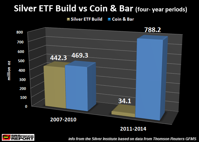
What a difference in the two four-year periods… aye? From 2007 to 2010, the build of Global Silver ETF inventories and Coin & Bar demand were pretty even. As we can see, a total of 442.3 Moz went into the World’s Silver ETFs, while 469.3 Moz was consumed as Silver Bar & Coin investment during this four-year period.
But, something changed significantly in the next four-year period. From 2011 to 2014, the net increase of Global Silver ETFs was a lousy 34.1 Moz compared to a staggering 788.2 Moz of Silver Bar & Coin demand. This proves, investors rather purchase physical silver than take their chances playing in the Paper Silver ETF market.
Here is the net change between these two periods:
Global Silver ETFs: 2007-2010 vs 2011-2014 = 92% decline
Silver Bar & Coin: 2007-2010 vs 2011-2014 = 70% increase
Again, I realize analysts will say the relatively flat inventory levels of Global Silver ETFs over the past couple of years were due to falling silver prices in 2013 and 2014. Yeah, I get that. However, that still doesn’t change the fact that a certain segment of the investment public purchased record amounts of Silver Bar & Coin even though prices declined significantly in 2013 and 2014.
The chart above proves that investors rather stockpile physical silver than gamble it in the paper silver market. Now, I realize there has been speculation put forth by the precious metal community that all the silver supposedly stored by custodians of the Silver ETFs might not be there. Unfortunately, there is no way of knowing.
That being said, most precious metal investors rather have guaranteed silver in their sweaty palms than a paper (or digital) promise in the future. I totally agree.
The world’s stock markets are currently experiencing some of the most worst volatility in years. One day the Chinese Hang Seng Index was down 1,000 points, then another day, it was up 600. The Dow Jones lost 1,800 points over a four-day period, then came back nearly 1,000 points over the past two days.
The markets are totally broken. I believe a small percentage of investors realize this as they purchased 23 oz of Silver Bar & Coin for each 1 oz build in paper Global Silver ETFs during 2011-2014. I think physical silver investment demand will only get stronger over the next several years as the broader stock and bond markets continue to disintegrate under massive leverage and debt.
If you haven’t checked out THE SILVER CHART REPORT, there’s a great deal of information on the Silver Industry & Market not found in any single publication on the internet. There is one chart in this report (Chart #19) that I can guarantee that 99.9% of precious metal investors haven’t seen before.


